InCircle
Product design
Diagnoses in 10 minutes, not 10 hours. Thx to UX, not AI.
Product design
Diagnoses in 10 minutes, not 10 hours. Thx to UX, not AI.
Overview
InCircle is a patient management platform for neurologists and care teams. Before the redesign, a neurologist preparing for a patient visit would spend up to ten hours pulling together the information they needed: lab results, imaging reports, medication history, clinical notes, appointment history. Ten hours of context-gathering for a thirty-minute appointment.
The data existed. The problem was that it was scattered across five different systems with no coherent way to synthesize it. The design challenge wasn’t data visualization. It was information architecture at human scale.
The Strategy
The initial brief was about efficiency: reduce the time neurologists spend preparing for appointments. That framing is correct but incomplete. Efficiency is a metric. It’s not a design brief.
The reframe: neurologists don’t care about efficiency. They care about confidence. When they walk into a patient room, they need to know that they have everything they need, that they haven’t missed anything, that the picture they have is complete. The ten hours wasn’t about effort — it was about anxiety. They spent ten hours because they were afraid of missing something.
Design for confidence, and efficiency is a side effect. That’s a different design brief, and it produces a different solution.
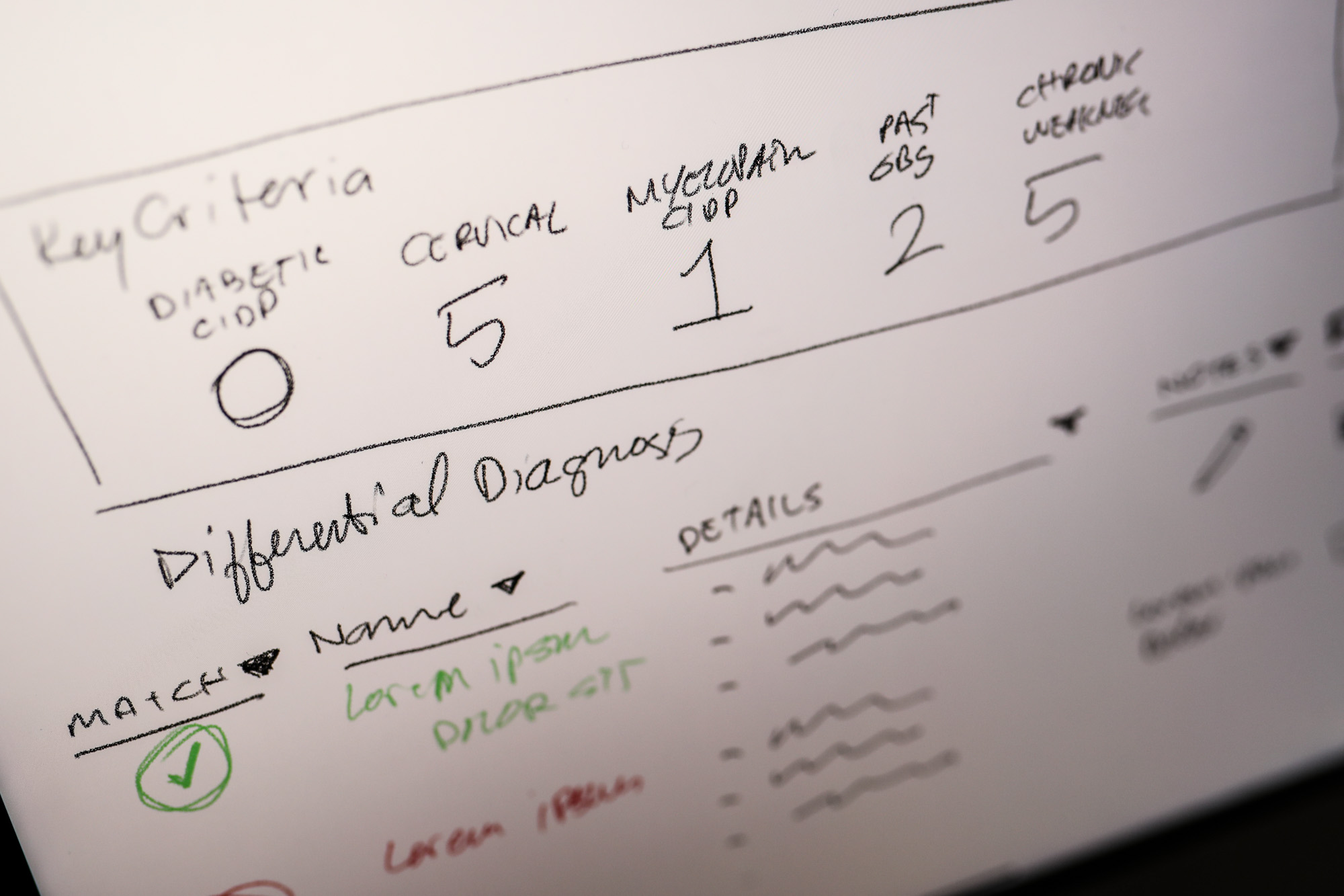
Four Principles
The redesign was guided by four principles developed with the clinical team:
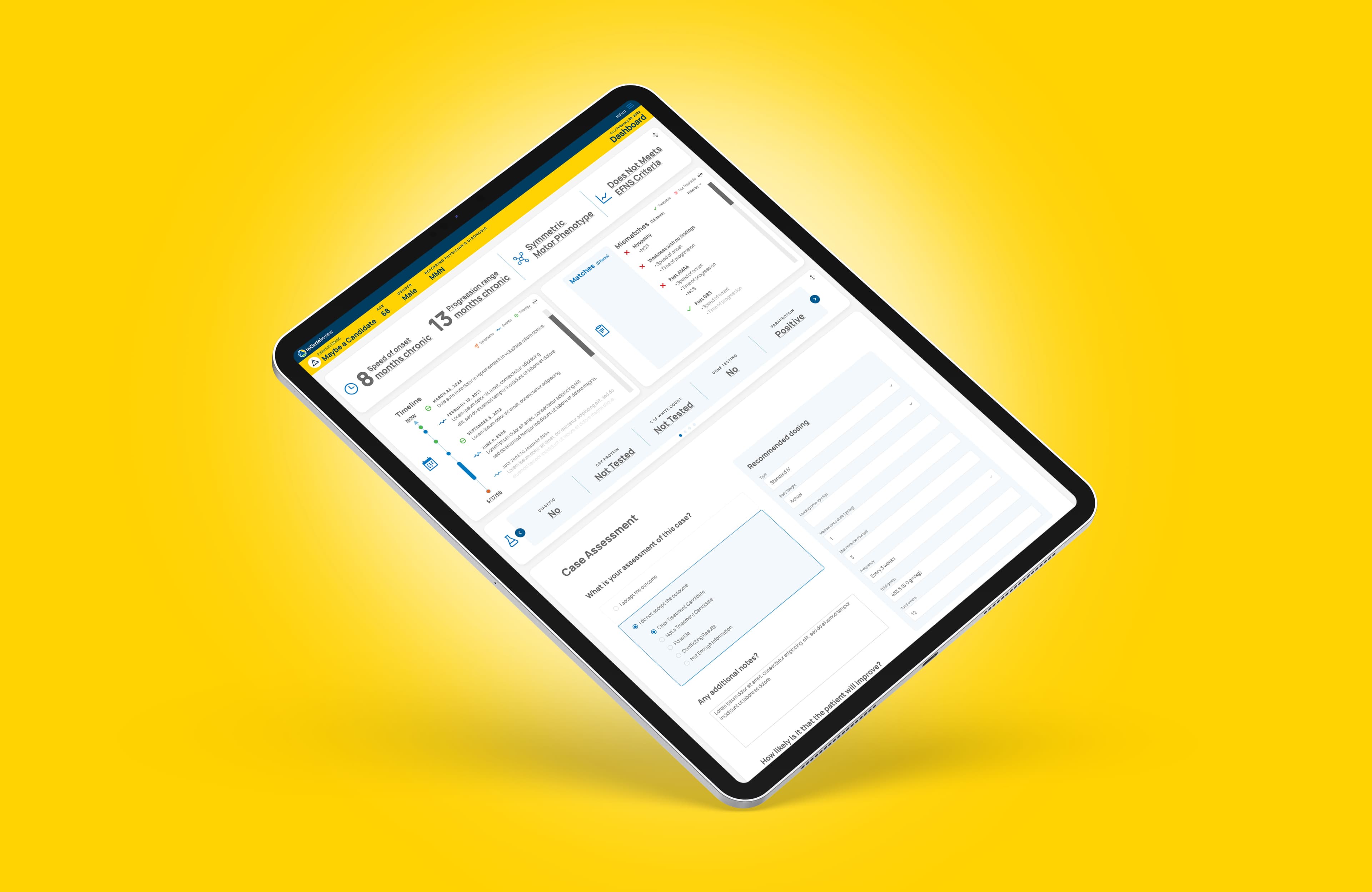
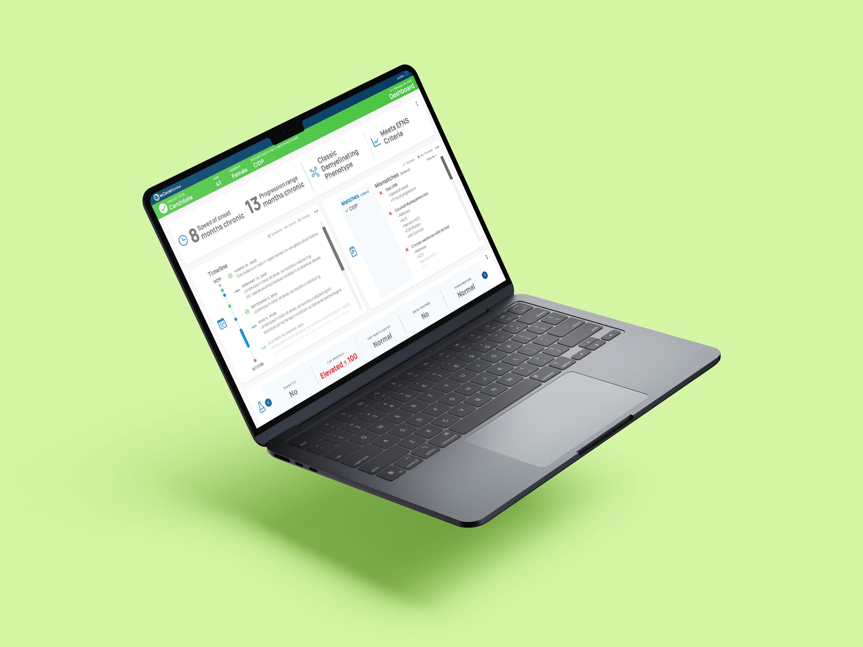
The Interactive Patient Timeline
The most significant design decision was centering the interface on an interactive patient timeline — a chronological view of everything that had happened to and for this patient, filterable by type (labs, appointments, medications, imaging, notes) and presented at a scale that let a neurologist see a year of history in a single view.
The timeline metaphor does something a dashboard grid doesn’t: it shows relationships. A medication change followed by a symptom change followed by a lab result — those three events next to each other on a timeline tell a story that three separate data cards never could.
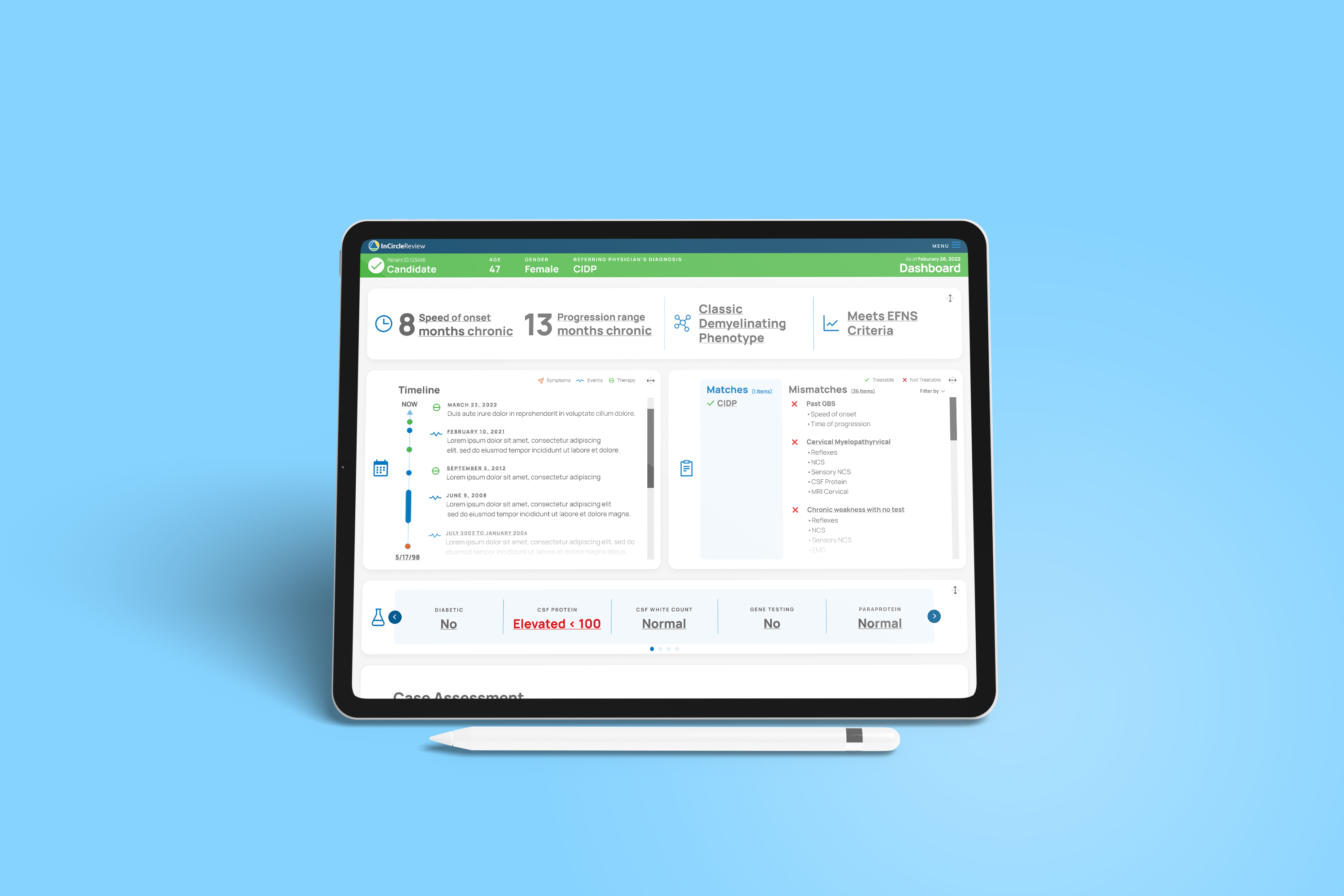
The Dashboard
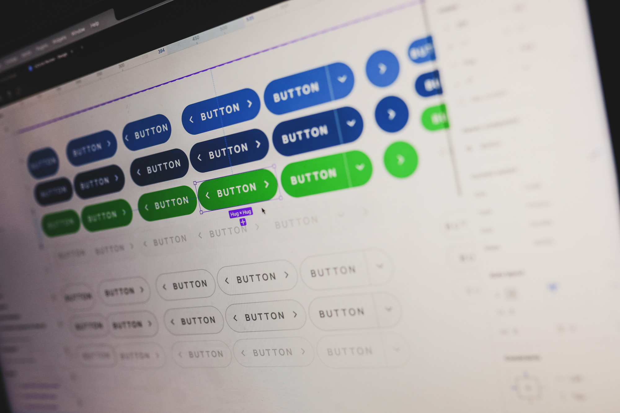
The dashboard was built on a modular grid using Figma autolayout — every panel was independently resizable and the layout adapted across the breakpoints neurologists used: large monitor at their desk, laptop in the exam room, tablet on rounds.
The autolayout demo we built in Figma became a reference artifact for the engineering team — not a spec, but a live demonstration of how the grid was supposed to behave. Engineers could resize panels in the prototype and watch the layout respond. That reduced implementation questions by most of what would have been a back-and-forth handoff process.
Clarity as the Product
Ten hours to ten minutes. The neurologists who piloted the redesigned platform reported that appointment prep went from a multi-hour process to something they could complete in the fifteen minutes before a patient arrived.
But the metric that mattered more was the one they reported qualitatively: they felt more confident walking into the room. Less anxiety that they’d missed something. More attention available for the patient in front of them.
Neurologists care about confidence. That’s what we designed. Efficiency was the proof that we got it right.
What This Project Reveals
The most important design work on the InCircle project happened before any pixels were placed. Reframing the problem from efficiency to confidence changed the entire design direction. It changed what success meant. It changed what questions to ask in user research. It changed what to deprioritize.
That’s the catalyst function in practice. Not doing design faster. Removing the barrier between a team and their best thinking — in this case, the barrier was a problem statement that was correct but incomplete.